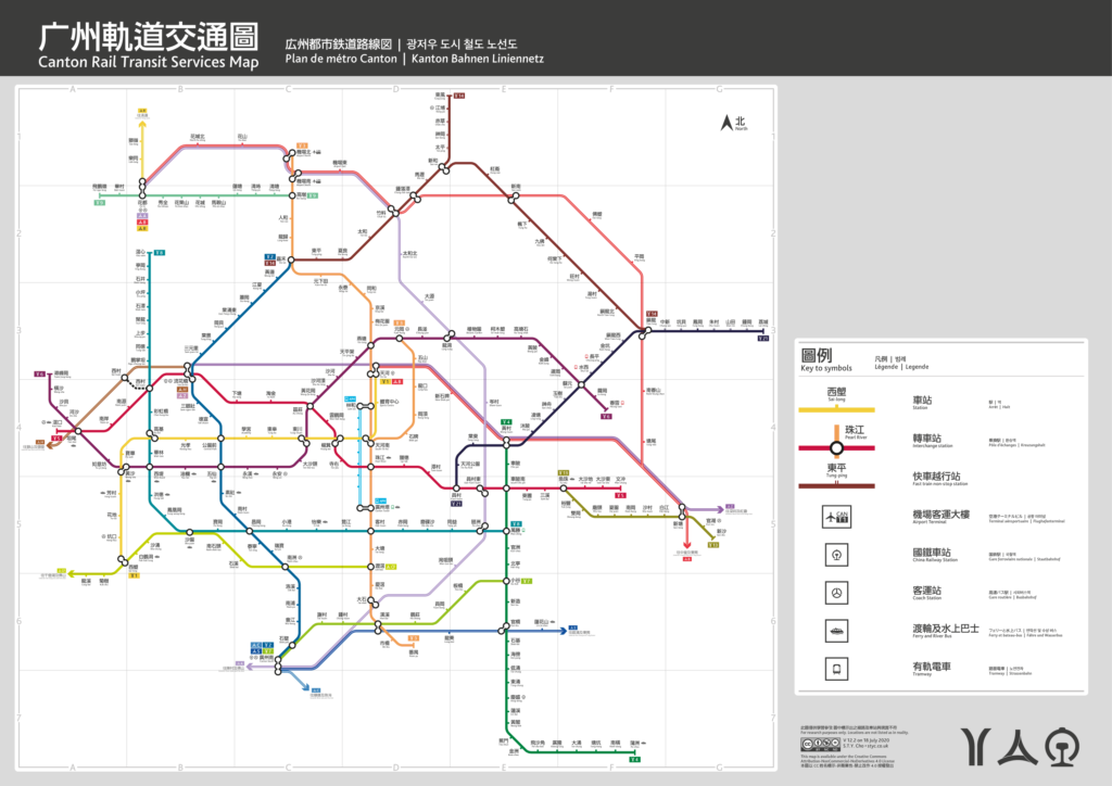
Redesigning Canton Rail Transit map
Since I left my route map designing business and went to a more boring academic route, Canton Metro officials have decided to embark on the unreturnable road of atrocity. The official map has become even more complicated and less readable and inadequate for modern aesthetics.
With the big gap in time before I start my PhD, I am able to pickup this long-abandoned hobby of route map drawing. The new map uses the ‘Traditional Character/傳承字’, wherein character shape and stroke closely follow those in the Kang-hsi Dictionary/康熙字典. For a further taste of traditionalism, I tried my best to preserve the historic name. Instead of using their official names, most of the stations take their name from their adjacent historical premises, preferably their pre-1949 name. City gates carry a lot of the Cantonese memories while their names are either hidden in some road names or forever gone after the gentrification in the 1930s. This map once again digs out all available names and use them in the stations, old gates such as ‘Oil Gate/油欄門 lit. Oil Market Gate‘ and ‘Tsing-hoi Gate/靖海門 lit. Pacify Sea Gate‘ rejuvenate on this map.
In addition to the conventional metro routes, inter-city and national rail commuting routes are included. There is no official colour palette for these routes, and something creative must be done. I used a long-gone ‘dirty trick’ by Canton Metro — copy from le parisian! The Canton routes 1 and 2 are the same colours as lignes 1 and 2 Métro de Paris — colours of railways are borrowed from Réseau Express Régional, these intercity routes are RER cantonais anyway.
More stories to come when I have time…
The distribution of this document should follow CreativeCommons guides CC-BY-NC-ND.
PDF version available as here: