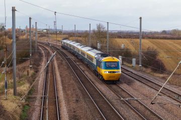
Fobytype Design
Edge-lit light box
A recent browse of old files has reminded me of my long-overdue dream of having a neon light sign of Cho Kee – my dining brand (ok – just my kitchen). Neon still seems impossible so I have to explore Read more…
A close and reliable source has revealed to me today (1 April 2022) that it is under the plan of HS2, DfT and Network Rail to test a set of HST and Class A4 and race for a new speed Read more…
This project was a risky take for me, as I was not an expert in electrical, probably clueless and ignorant of the whole subject. During my university degree, I had a particularly unpleasant time studying electrical, saying by achieving less Read more…
Recently, I have been extremely procrastinative in work and productive in other stuff. Therefore, you might see me switching topics from design to PC setting and back to PhD research in a row. You know a deadline is coming. I Read more…
I have just re-discovered the usage of this blog — not only serves as a platform to present stuff, but also somewhere to throw internet rubbish, paid by the rubbish-producer himself, at least. I have been fiddling around with an Read more…
Network Rail released a new way-finding design guideline. There’s some great returns, like a redesigned ‘Rail Alphabet’. But there’s also some inferior elements, like the eye-tearing spacing. I will write more about it once time allows. The design guideline is Read more…
Catching a train up the King’s Lynn line, and passing through a myriad of either retro-fit or real station signage, varying from the modern-day franchise standard signs to the Great Eastern Railways. The one that caught most of my attention Read more…
Since I left my route map designing business and went to a more boring academic route, Canton Metro officials have decided to embark on the unreturnable road of atrocity. The official map has become even more complicated and less readable Read more…
Not particularly mean anything. Just want to create an illustration of some art-deco style.
The original poster found online looks like this, nothing wrong. A very typical Post WWI style, some sort of art-deco. Nice looking Gill Sans-ish typeface – admittedly at that time nothing was standardised, maybe is a badly made Gill Sans. Read more…