Fobytype Design
‘Yellow Object’
Not particularly mean anything. Just want to create an illustration of some art-deco style.
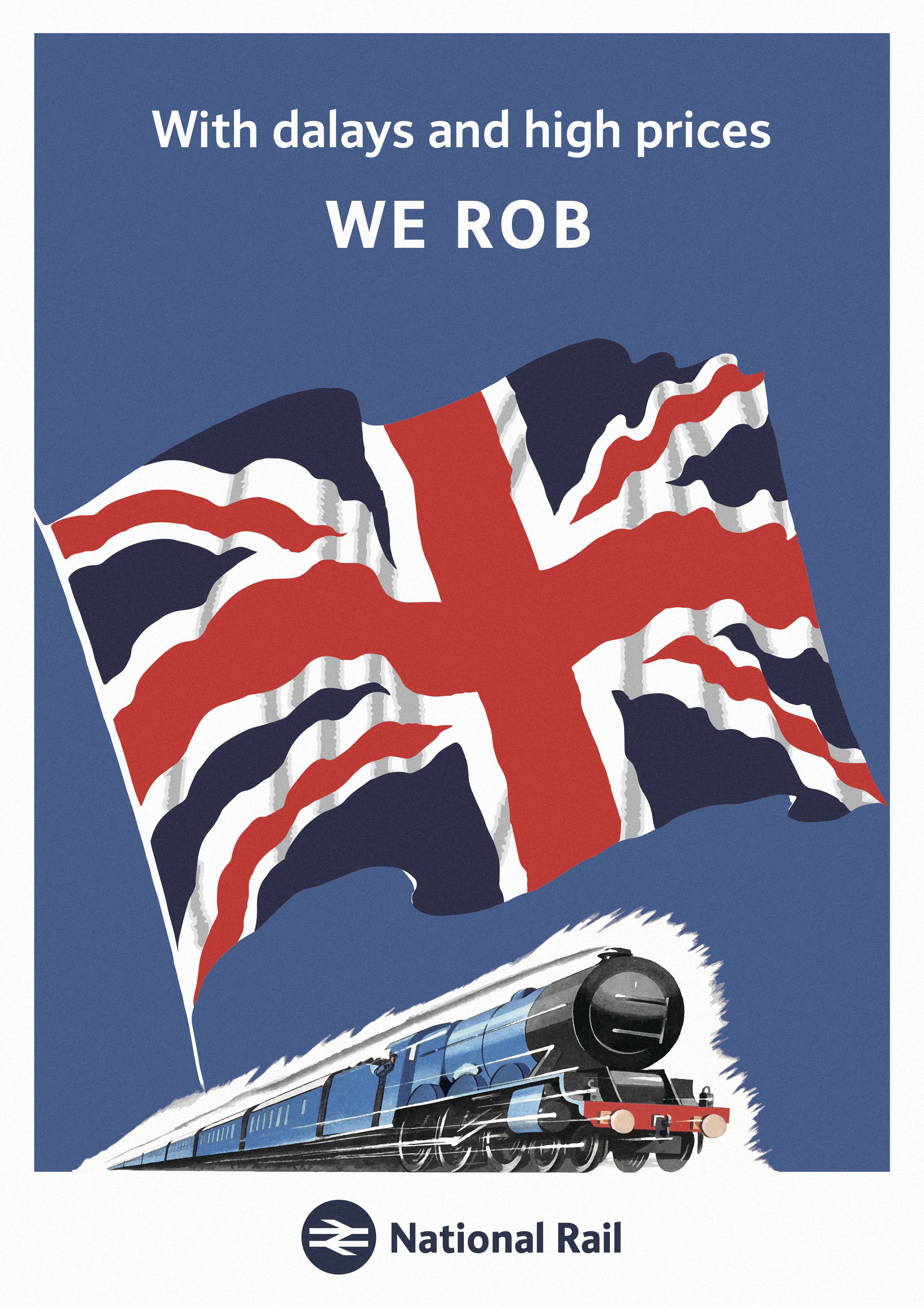
The original poster found online looks like this, nothing wrong. A very typical Post WWI style, some sort of art-deco. Nice looking Gill Sans-ish typeface – admittedly at that time nothing was standardised, maybe is a badly made Gill Sans. Read more…
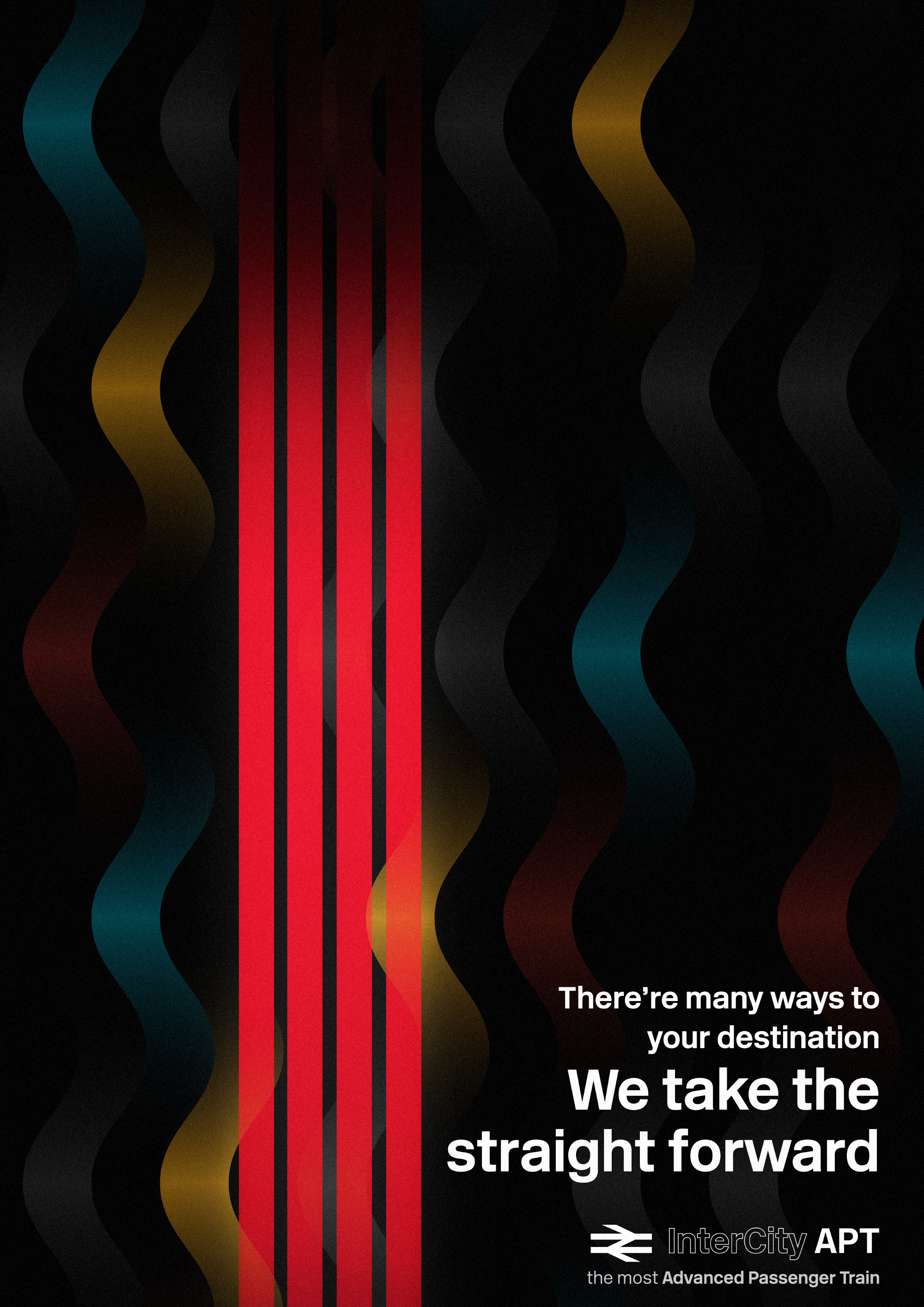
The new IEP (Intercity Express Project – Hitachi) and Class 700 (Siemens) was blamed since their first mile on the British track, dodgy quality, horrible internal decoration, and most importantly, the on-board passenger iron-board (thanks for their generous) seats. However, Read more…
Stories Once upon a time, I was amazed by typeface using on Britain’s railway signages (yes, same as what I did with TB1). The numbering typeface comes to my attention, attracting me with its British humanity style… At that time, Read more…
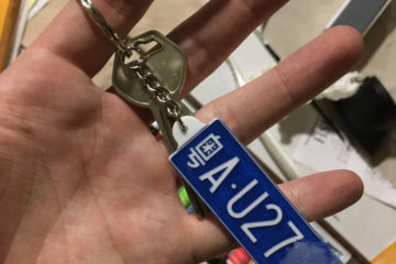
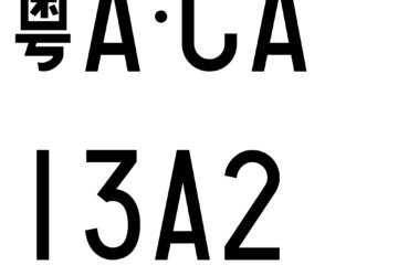
p.s. Some explanations on Chinese Numberplate structure. First Chinese character stands for the registration province, following by letter usually A-Z (can be less), denotes registration city (e.g. ‘粤A’ is the code for the provincial city of Guangdong Province, a.k.a. Canton Read more…
While CR Font in progress, I’m happy to announce the beginning of another project: Chinese Number Plate. As the design of new number plates revealed last year, it has drawn to concern that this version of numberplates may come to Read more…