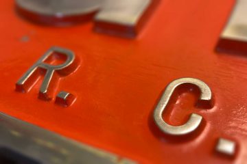
Gill Sans on the British Railways trains.
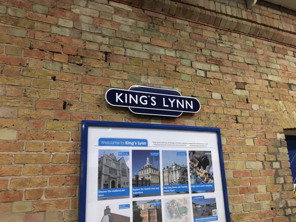
Catching a train up the King’s Lynn line, and passing through a myriad of either retro-fit or real station signage, varying from the modern-day franchise standard signs to the Great Eastern Railways. The one that caught most of my attention was a ‘Hot Dog’ (pre-1960s) sign with ‘British Railways’ (BR) on it, which has a lot of defects oppose to the properly-made ‘King’s Lynn’ sign, as the BR sign used a Gill Sans found on a home computer, and it should not. Therefore, I asked myself, why can’t one make a proper BR sign nowadays, whereas the Network Southeast signs down the line at Downham Market seems much more like an actual sign of its age? Of course, this goes down to the availability of typefaces.
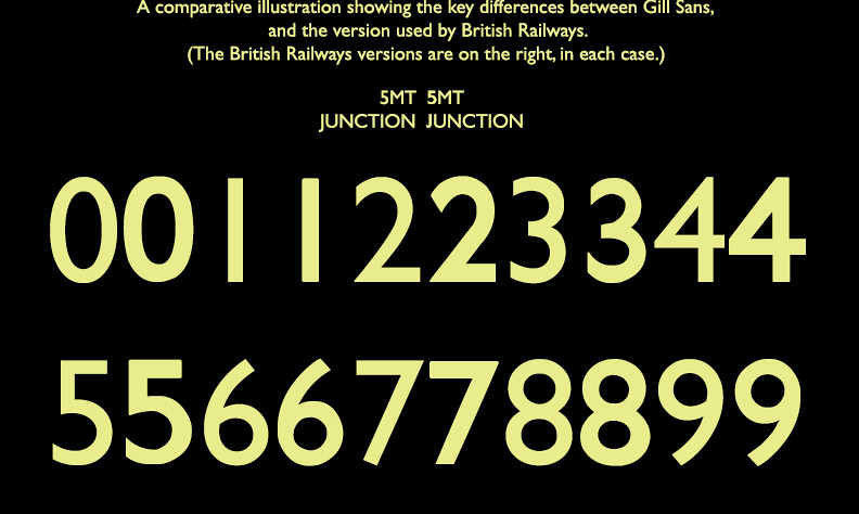
Many railway enthusiasts would encounter the same question when they attempt to create a retrospective railway sign with Gill Sans. Why would the letterings on an old BR sign look so different from the one I just created from a computer? Why is it so much clearer and more elegant? Although the typeface on it looks like Gill Sans, named Gill Sans, it is not the same Gill Sans that comes with the computer system. Many versions of Gills Sans were produced throughout history and there are many varieties. When Monotype created their digitised version, they decided to use a different version from BR. However, when it comes to Rail Alphabet on the post-1960s signs, the only digitised version available does come from BR, and it is based on the exact same drawing they used on signs. (I’m not going to make any comment about that Rail Alphabet 2 here in case I go on for days and nights)
Optical size is one of the reasons behind the difference in all these Gill Sans. Letters for large prints normally use a different design from the ones in the text. Monotype only digitised Gill Sans based on their text version and left out the larger sizes. Therefore the only available ‘Gill Sans’ on a computer is designed for texts but not for anything larger. After some inextensive, unprofessional, and pretty much inconclusive research (comparing on PhD in engineering I’m reading this is for sure a sub-standard piece of research), I found that the computer font version of Gill Sans is based on a much lower optical size design of Gill Sans, say around 8-14 pt. They are a great design for content, typeset around 8-14 pt for a reader without impaired eyesight. Especially for letters such as ‘C’, ‘G’, and ‘d’, some curves are artistically skewed to produce an effect of a larger opening. Such features are helpful when designing text fonts as it significantly improves the readability, no one would want to spend more than a second differentiating a C and G like a Victorian trying to tell difference between GWR and CWR. But when you trying to erect something onto the roof by getting it larger and thicker, it’s another story. You need something special for the larger and thicker.


I’m not the first one found this. As Robert Tarling noticed here (also picture below) about a decade ago. Several noticeable differences including a shorter ‘J’, and ‘B’ having a more regular shape in the BR variant. The flamboyant font might be good for bringing a hint of the renaissance into the content, but signage design in public service should probably prefer something neutral and done to the ground. So these fonts are different, but technically they are not different ‘Typeface’. They share the same features, and, very likely, the same designer. So they are technically Gill Sans, but a different version for some specialised use-cases.
As I tried to dig out more about this special version of Gill Sans, it becomes clearer it quite likely originates from the large-print wood letterpress.
I will talk a bit more about this terious research when the time goes along…
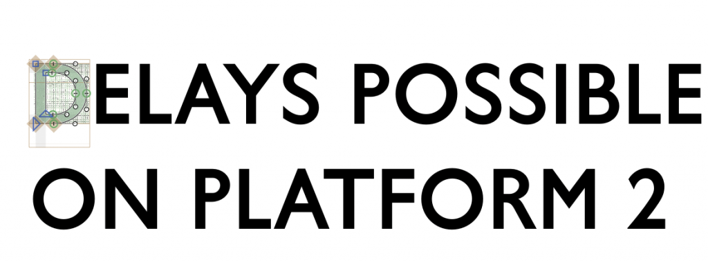
Annoyingly, nobody has ever attempted to digitise the titling sized Gill Sans. This is rather irritating for my OCD, and I decided to embark on this project on digitising this marvellous typeface.
I aimed to complete capital letters and numbers on both ‘Light’ and ‘Medium’ weights as the first phase of this project. This part is rather straightforward as Mike Ashworth has posted BR Sign Standard on Flickr. The design job is more like using tracing paper on Glyphs.

This article is still incomplete, so does the typeface.
I have been caught up by other matters, possibly on the same level as uselessness as this.
Obtaining the typeface
The full fontface is still in its development stage. However, an essential open-source pack is available to download from GitHub. This basic pack does not contain any kerning settings and glyphs beyond those included in the BR sign manual.
Please kern the letters properly when using.
This open-source typeface is free and licenced under Apache 2.0 license. Therefore, you can use and edit it freely, but commercial use is strictly prohibited unless obtained written permission from the author.
Meanwhile, why not consider