DIN1451 is over-rated — finding the lost signage lettering with straight edges
If you ask an amateur font, self-proclaimed, person like me ‘what font should I use if I want something industrial, and minimalist’. You are very likely be told ‘DIN 1451’, the classic. I thought the same, but since I have always been obsessed with this specific type of sans-serif typefaces, I went for a further dig. It turned out, there are much more good stuff out there remained undigitalised.
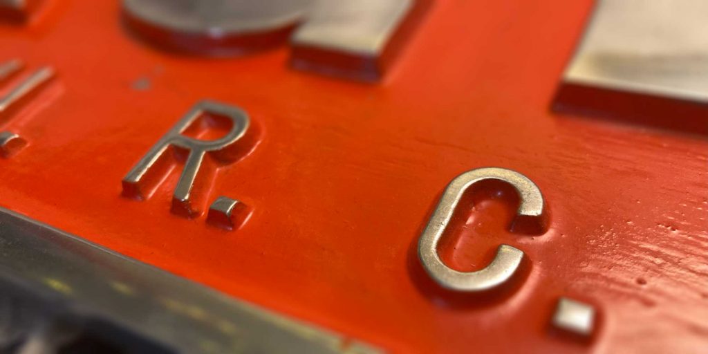
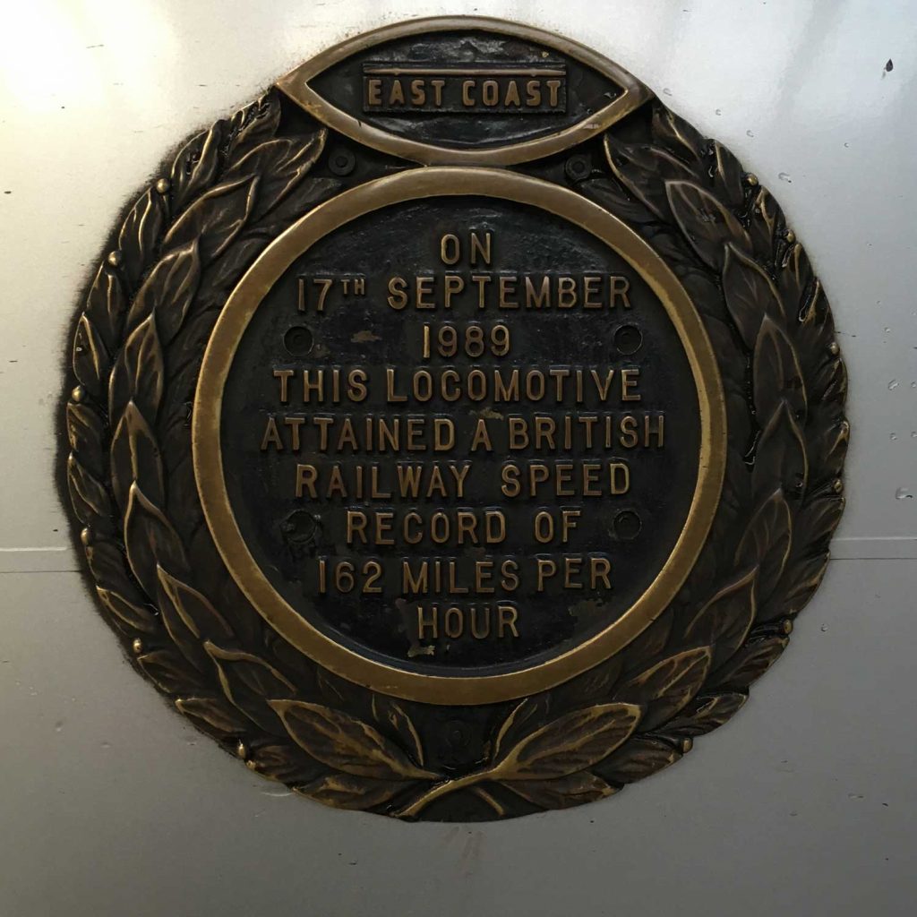
The first kind is the standard casting patterns, easily found on places like manhole covers, old machines, or any generic cases. It is much more elegant and humanistic than the cold German DIN. It still lives in many casting foundries, but I could not find any digital font on this. Neither have I yet got my hand on a full set, despite its patterns appear to be available to purchase here. The plate on a Class 91 clearly used this typeface. The blog’s photo is taken from one of the original ‘Eagle C.U.R.C.’ nameplates, also uses the same typeface. Further on the railway-related subject, Procast also uses this type on various of their casting signs (see attached Instagram posts).
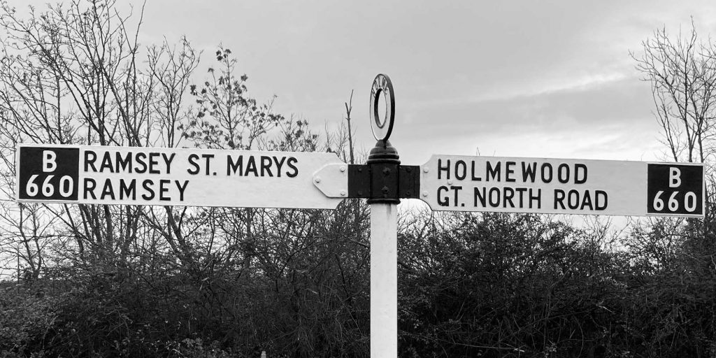
Things gets more complicated from here, various customised typeface have similar shapes, but are different in details. The easiest to find one is seen in many street signs from a long time ago till the 2000s. Some suppliers (here, and there) still show pictures of them in their catalogues, but these streets were built in the 1990-2010s (such as John Milne Drive built in 1999, This photo of Fitzroy Square KY1 2 taken at a street built in 2010s), but new signs increasingly tend to use Kindersley. This timing renders that computerisation is killing these undocumented typefaces — the previous casting type only survives because the unique market in the heritage railways to keep it going. I don’t think the council, or road signs are usually that lucky — when they are gone it is hard to get back. A good old example from Holme (in the Fen) is shown here, probably from 40s I presume? It appears that the typeface has a ‘condensed’ width, but not for all letters, similar examples are also available online (see below for an example, same ‘E’ are used).


Numbers on this typeface is more interesting. I tend to believe it pairs with the standard MoT alphabet set.