You want some nice posters on your wall but your mind detours
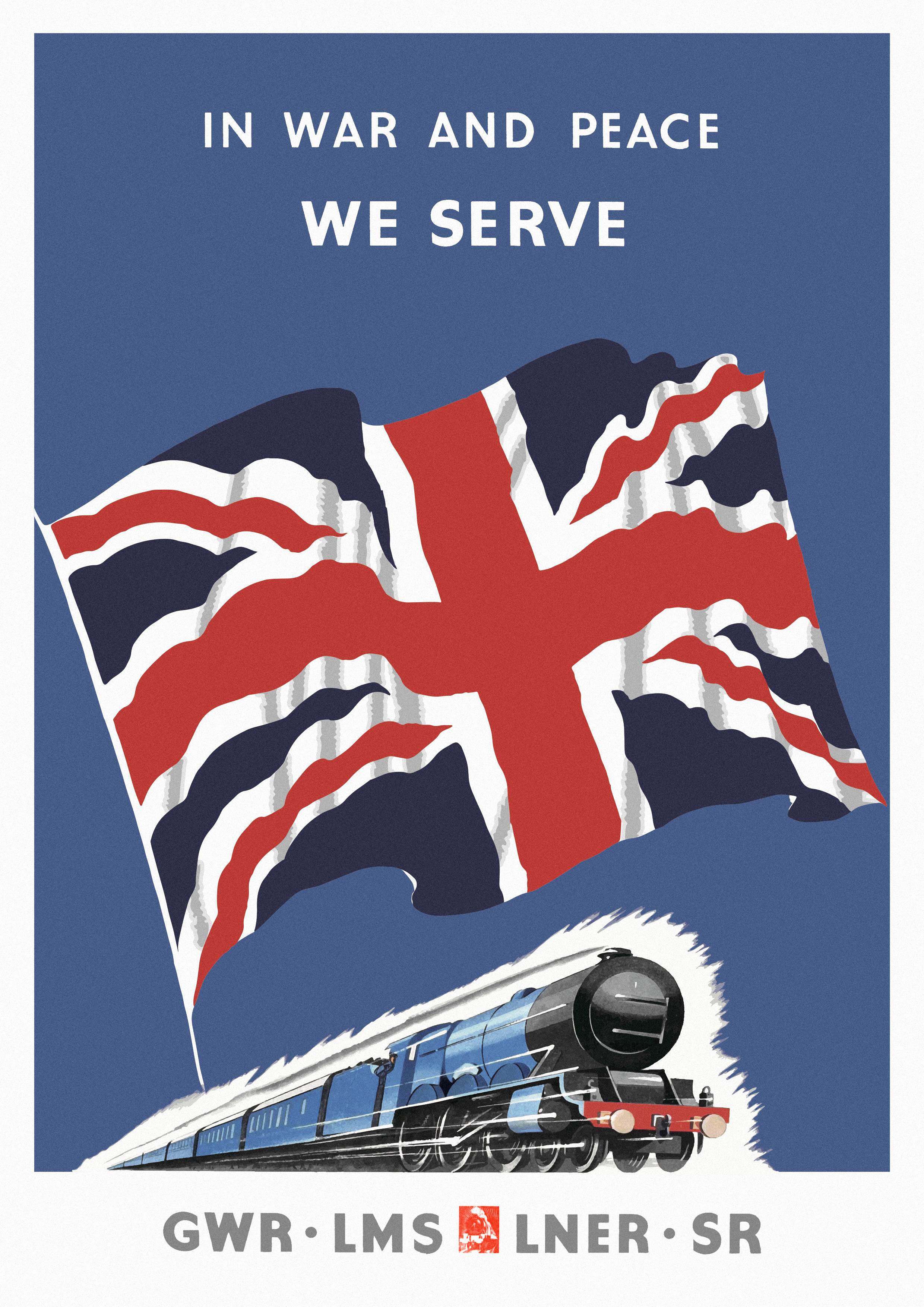
The original poster found online looks like this, nothing wrong. A very typical Post WWI style, some sort of art-deco. Nice looking Gill Sans-ish typeface – admittedly at that time nothing was standardised, maybe is a badly made Gill Sans.
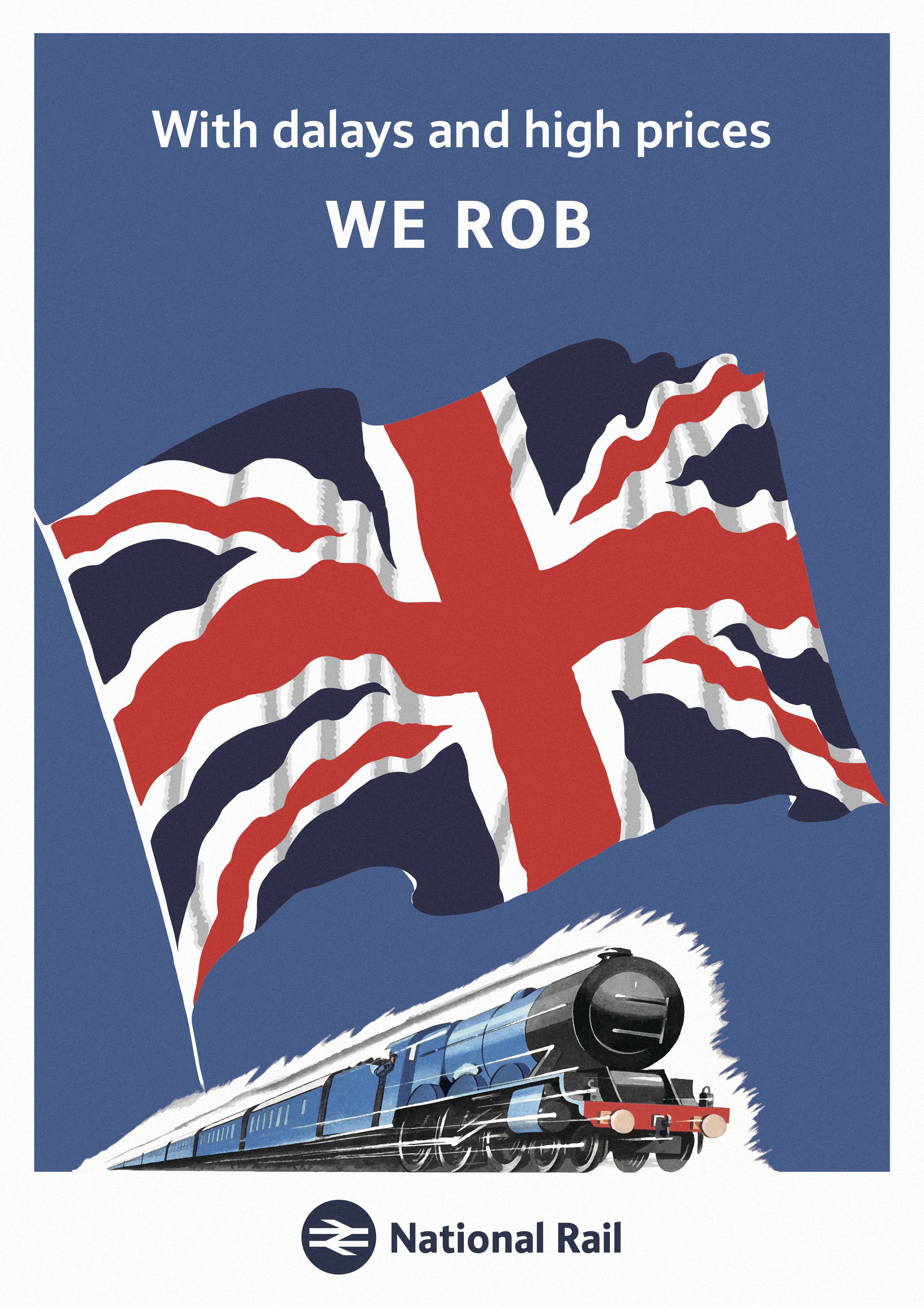
So, what if it comes to modern days? Firstly 3% ticket rise annually… And ‘Big Four’ are long gone – nor its successor British Rail – so, let’s use National Rail. In terms of typeface, I would choose Network Rail’s standard Brunel. So, here we go!